UNITE
A complete UX and UI design project developed independently to reimagine the adoption process.
My Roles
UX Designer, UI Designer, UX Researcher, Product Strategist, Content Designer, Brand Designer
Time
Feb 2025 - Apr 2025
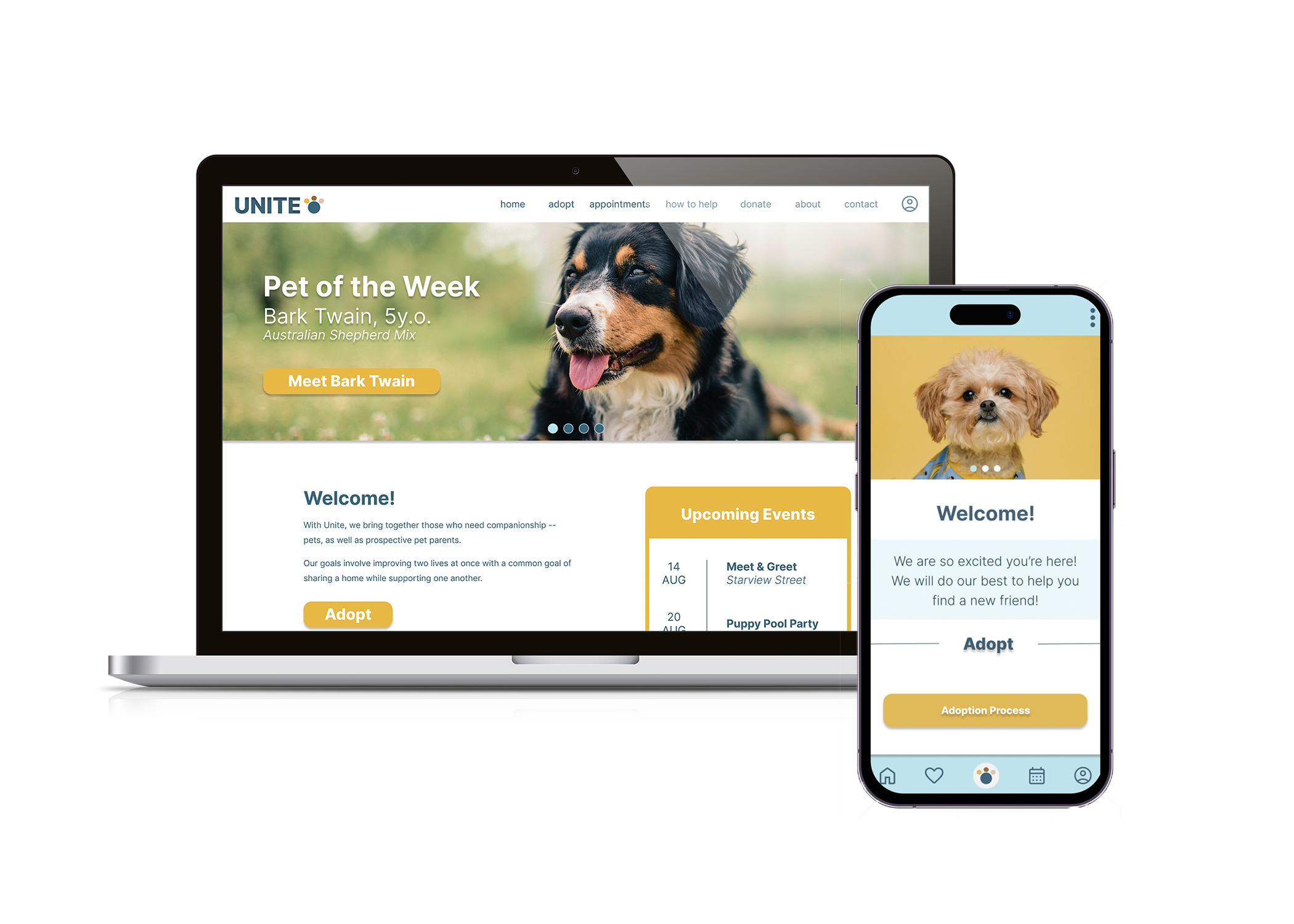
Unite is a self-initiated UX project aimed at modernizing the pet adoption experience. Designed as both a responsive website and mobile app, Unite offers a clean, efficient, and user-friendly platform for individuals to discover and adopt pets that align with their lifestyle. Inspired by the limitations of outdated platforms like Petfinder, this concept focuses on clarity, organization, and ease of use.
This solo project was completed over the course of three months. I led every stage of the design process — from ideation and user flows to UI design and prototyping — using Figma as my primary tool.


Identifying the User Pain Points
Adopting a pet should be a thoughtful, guided process — but most shelter websites don’t support that. Many are visually outdated, hard to navigate, and lack core features users expect, like appointment scheduling or accurate availability.
Users are often left to call or visit the shelter without knowing if the animal is still there, which creates the pain points of confusion and disappointment. There's also no clear adoption flow and no space to get to know the animal beforehand — all of which can lead to rushed decisions and an increased risk of returned adoptions.
In my research, I found that people often don’t know where to go to accurately find adoptable animals online, and many existing platforms feel unreliable or irrelevant. The user experience is disconnected from the emotional and practical realities of adoption — and that’s a gap worth solving.


Crafting Solutions
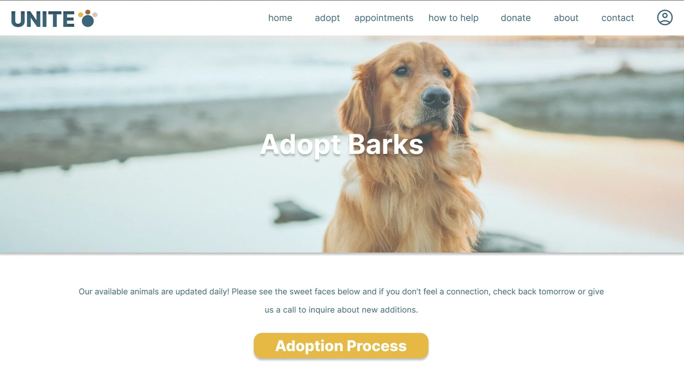
Unite is a responsive web and mobile platform designed to support both aspiring pet parents and new adopters. The experience focuses on making adoption more accessible, informative, and user-centered, while also helping improve outcomes for the animals.
In addition to browsing adoptable pets, users can explore resources on responsible pet ownership, including topics such as TNR, low-cost vaccinations, surrendering an animal, and ways to get involved through volunteering, fostering, or donating. The interface includes intuitive navigation, clearly defined categories, and user flows designed to guide people to the right information quickly and effortlessly.
To encourage more thoughtful adoptions, Unite features an appointment system that allows users to schedule a specific time to meet animals in person before making a commitment. The goal is for users to feel inspired, supported, and confident throughout their experience, while interacting with a clean, frustration-free design.
Early Insights

Since this was an independent concept project, my research was primarily observational. I explored a range of existing adoption platforms and shelter websites to understand how users currently find and adopt pets. Through this informal analysis, I identified several common pain points, including outdated and cluttered layouts, unclear adoption processes, missing information, and a lack of user-focused features like appointment scheduling or pet availability updates.
I also considered broader patterns in user behavior, such as the difficulty many people have finding reliable, up-to-date listings for adoptable animals. In some cases, even well-known platforms lacked visibility or trust, suggesting a need for a more modern, intuitive experience.
While I wasn’t able to conduct formal interviews or usability testing, these early insights helped me shape the goals, structure, and features of Unite with a strong focus on usability and clarity.
Designing the Experience

Before moving into high-fidelity design, I created wireframes and low-fidelity layouts in Figma to map out the core structure of the app and website. I focused on user journeys that felt most essential to the experience, including scheduling an adoption appointment, modifying or canceling that appointment, and accessing key resources like low-cost vaccines or TNR services. These flows helped guide the overall structure and navigation of the platform, ensuring that each interaction supported a clear and intentional path.
Ideation & Wireframes
UI Design
Unite was designed to feel calm, clean, and purposeful. The overall visual style is minimal, with an emphasis on clarity and ease of navigation. I chose a color palette that supports a sense of trust and friendliness: soft white backgrounds, light blue (B6E4EE) for visual separation between sections, deep blue (3B647A) for text, and a warm yellow (E7B844) for call-to-action buttons.
The layout was intentionally kept minimal, with generous white space to create breathing room and ensure that every element felt intentional. Instead of overwhelming the user with visual clutter, I prioritized hierarchy, spacing, and intuitive grouping to make key actions feel natural and intuitive.
To maintain this simplicity, I avoided secondary navigation menus or overly complex filters on the main page, focusing instead on a clean, approachable structure that invites users to explore at their own pace.

Project Takeaways
What I’m most proud of in this project is the design itself. Unite feels clean, modern, and thoughtfully built, not just in its visual style but in how it considers user needs. It reflects the kind of professional, user-centered work I aim to create.
One of the biggest challenges was organizing all of my ideas into a cohesive experience. Building the structure, designing user flows, creating the branding, and managing the visual system all from scratch required a lot of problem solving and decision making. Without access to real users or a live site to test, I had to rely on best practices and thoughtful assumptions to guide the experience.
With more time and resources, I would prioritize gathering user feedback and refining the design based on real interactions. I would also explore expanding functionality with more advanced
filters, the ability to favorite specific shelters, and better handling of real-world scenarios, such as when a pet is adopted before a scheduled appointment.
My vision for Unite is to create something as recognizable and reliable for pet adoption as MyChart is for hospitals. I want it to become a trusted, centralized platform that both shelters and adopters can count on.
Completing this project reminded me of what I’m capable of. There was a point where I paused work on it due to self-doubt, but revisiting it with fresh focus helped me push through and finish something I’m truly proud of. It reinforced the value of perseverance and trusting my own design process, even when I’m working independently.